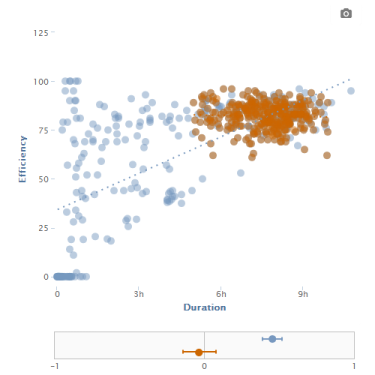
Once you have some data in Zenobase, you can investigate correlations. For example, does your sleep data (recorded manually, or through a service like Fitbit, Withings or BodyMedia) show a correlation between time in bed and sleep efficiency?
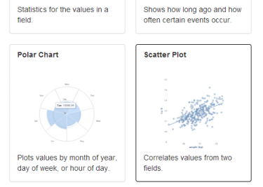
To correlate data, use a “scatter plot” widget. Click the plus icon next to an existing tab to add a new widget to a dashboard, or click the gear icon on the tab of an existing scatter plot widget to update it.
To configure a scatter plot, choose two fields to correlate, how the values of each field should be aggregated (average, sum, min or max), and at what interval (hour, day, month etc).
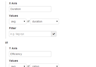
To correlate the values from one field with the values from the next day, set the interval to “day” and the lag to 1. To correlate with the values from the previous day, set the lag to -1.
Set regression to “linear” to show a line that is an approximate indication of the strength of the correlation in the scatter plot.
Appropriate filtering of the data is the key to meaningful correlations. For example, the data might show a strong and significant correlation at first (blue; the r value is 0.5, and the confidence interval, indicated with two bars, and spanning the range where p < 0.05, does not touch r = 0). But after removing problematic data, the correlation is neither large nor significant (orange).
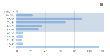
To remove outliers from the data, use a “histogram” widget. For example, if you know that you never slept less than 5 hours or more than 10 hours, you can filter on that range of duration values.
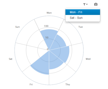
To restrict the data to certain hours of the day, days of the week, or months of the year use a “polar” widget. For example, if you don’t sleep regularly on weekends, you might want to exclude weekends.
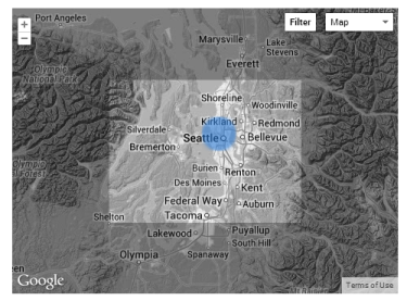
To restrict the data to certain locations, use a “map” widget. If your data doesn’t have any locations, you can use the moves-locate task to add location data from the Moves app. For example, you might want to exclude nights you didn’t sleep at home.
To correlate data from two buckets, create a view that contains the two buckets–either complete, or filtered.
To correlate the number of events rather than an aggregate value of a field, choose the “timestamp” field and “count”.
If correlating values from the same field, set a different filter for x and y, e.g. “tag:Gym” and “tag:Bakery”.
Last–but not least–don’t go digging for correlations without having a specific question in mind, and understanding how the data was acquired.